
Mobile phone is the way of the future. It is more versatile and provides more value to the end-user than a computer. Nowadays, mobile phones are used more than desktops, laptops, and tablets. More and more web users are shifting from desktop computers to smartphones. Since people started using mobile devices on the go, mobile search has overtaken desktops. The usage of apps, voice assistants, and IoT devices for online searches has increased exponentially. It has become so important to optimize your website to work well on mobile devices.
Wondering why mobile is so much important for small businesses?
Well, the answer is:
-
- Mobile-friendly websites work faster and show up higher in search engine results.
- Mobile searches make up most of the searches on Google.com.
- Majority of the traffic comes from mobile devices.
- If your website is not mobile-friendly, visitors will leave in no time.
In order to grow your small-scale business, it is crucial to invest some time to optimize your website and provide a mobile-friendly user experience.
What is a Mobile-Friendly Website?
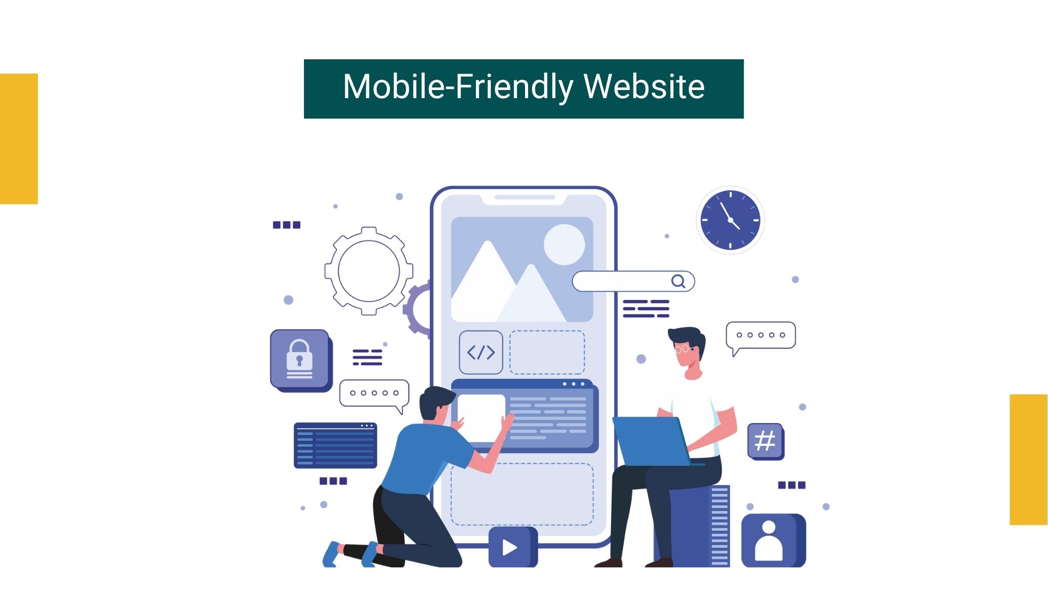
Responsive web design means no matter how big or small the screen is, it will fill the screen and the information in a clear way. A mobile-friendly web design allows your website’s information to be easily readable and accessible to all platforms including a much smaller screen of smartphones, tablets, and even watches. At a complex level, a mobile-friendly website means utilizing all the capabilities of mobile devices to deliver a satisfying experience to the users on the go. If your website isn’t optimized, then you are missing out.
Why Mobile-Friendly Website is Important for Your Business?
The use of technology is increasing rapidly, which is why it is today’s business necessity to discover an efficient and cost-effective solution to optimize your website.
Irrefutable truth: “To succeed your website better employ mobile-optimized web design”
Potential customers expect speedy answers and faster access. Their experience on your website is most likely to influence their impression of your business.
To design an effective mobile-friendly website you need to look at the following elements:
-
- Does your website load quickly?
- Is it easy to navigate?
- Is it easy to perform actions?
Nearly half of the visitors will leave their mobile if your website fails to load within 3 seconds. Visitors will leave if you do not optimize your website to provide a great user experience. A bad mobile experience may hurt your user base.
Better play nice!
Your users, customers, or your business partners just want their information served fast, fresh, and convenient. So, you better focus on the ways to optimize your website design that encourage visitors to perform desired actions depending upon your small business marketing objectives. Emphasis on winning friends with a responsive web design.
Now that you know, what is mobile-friendliness and why it is crucial to have a mobile-optimized website; let us dig in more to learn the process of mobile optimization.
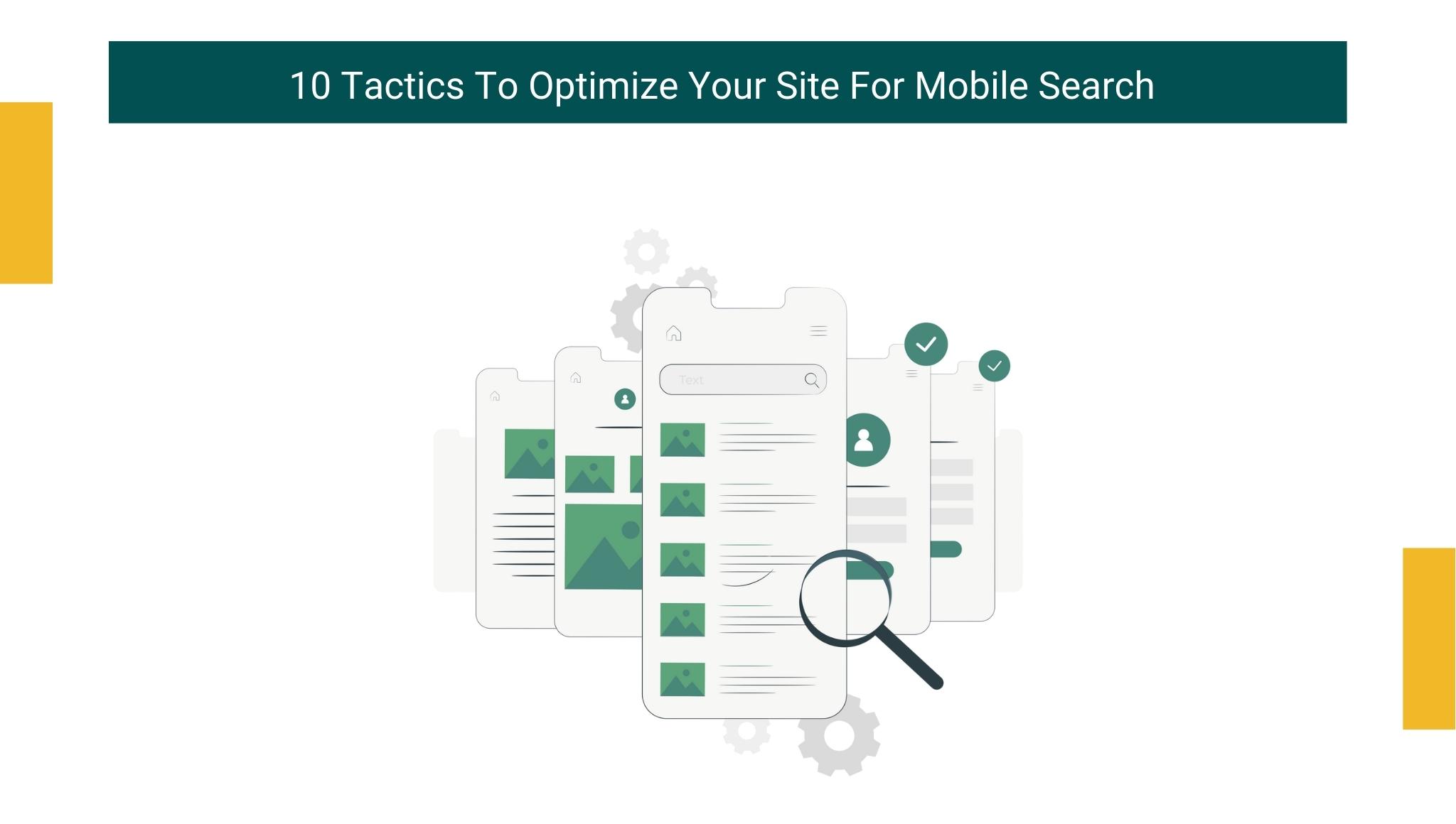
10 tactics to optimize your site for mobile search
Mobile search now dominates a significant portion of the online space. To be an effective marketer you need to create a strong user experience regardless of the device. The context of mobile search is different than that of desktop devices.
To get you started, here are the 10 best ways to make sure your website shows up on mobile SERPs:
1. AMP is your savior
Accelerated mobile pages (AMP) are lightweight web pages used to create a fast mobile experience. The technology used behind AMP enables web pages to load more quickly for mobile devices. AMP utilizes a stripped-down version of Hyper-text markup language. It is a web component framework that allows web pages to load smoothly, and fast and prioritize user experience.
It helps businesses to provide a consistent and fast experience across all devices, which means better speed can improve user experience. To employ AMP, you don’t require any super-savvy computer skills. You can reduce the need for a vast developer since it is easy to build.
AMPs were included in Google’s mobile search algorithm in 2016.
Technically, AMP requires 3 main components:
-
- AMP HTML
- AMP JavaScript
- AMP Cache
2. Use schema markup
As Google remains the king, it always works on providing the answers to user queries. When you search “how to optimize a website” for example, Google presents you with an info-box that contains the answer to your related queries. This is possible only by implementing schema markup. It doesn’t require a technically savvy person to get started. There’s a plugin for WordPress called schema app structured data that offers a responsive web design. You just need to activate the plugin, add your logo and business name, and BAM, your content is optimized to be fully understood by search engines resulting in higher traffic and increased click-through rates.
3. Speed is the deciding factor
Speed up anything and everything. Slow loading time translates to a high-bounce rate. High-ranking results have faster page load times. Web page loading speed is quite an inevitable thing for your website when it comes to desktops, but if you think that your website loading speed remains the same for mobile phones as well, then you are wrong. As mentioned earlier, web pages load differently on mobile devices. It is important to optimize your website to improve your web page’s loading speed and generate high-quality leads for your business.
4. Make your site responsive enough
A responsive web design is mandatory to maintain a higher ranking on Google. Google has made it very clear that it is going to prioritize websites that are responsive and fits the screen of all devices. The responsive HTML framework adapts according to the screen size and orientation of the device viewing the content. It means HTML allows your website to fit well enough on-screen that is 5 inches to the screen that is 10 inches. If you succeed in crafting a responsive design for your website then you can rank high, drive a good amount of traffic to your website, and eventually, gain a good amount of revenue for your business.
5. Squeeze the image size
Images are necessary for dynamic web content and visual content is the topmost priority for digital marketers. By compressing an image, you enable web pages to load faster. Compressed image frees up space and decreases page load time. It’s a win-win situation!
For example, imagine that you are a blogger who uses tons of graphs, screenshots, videos, and other types of visual content within the blog to attract followers. In order to optimize your website, you can compress image files up to 95% to reduce the file size using photoshop without hampering the quality. While visual contents are important, there’s one type of visual content that needs to be removed quickly from your website.
Any guesses?
6. Remove flash
Flash is banned from Google’s AMP project. Vulnerabilities in flash make it less attractive in web designs. Cheesy animation might appear good on pen and paper, but in the real world, they look less operative. The trend of simple designs is ruling the internet. So, we suggest you exclude flash from your site.
7. Check if your site layout is mobile-friendly
While crafting a website you should not just look at the technical side but also the non-technical aspects of your website such as fonts and colors. You need to check whether your website‘s content design is good enough on focusing the key points of your site.
8. Use open-source tools to improve your website’s experience
If you want to enhance your website ranking on Google, then you should run a mobile-friendly test which you will get in the Google search console. This test is conducted by open-source tools so you get the results faster than expected. If you pass this test then you are most likely to gain more traffic and enhance the end-user experience. If you fail the test, fix the problems and repeat the test until you get the best results.
9. Identify how people look for things from their mobiles
Look at your mobile website. If you think that people search in the same way on both desktops and mobile devices, then I am afraid you’re wrong. While searching from a desktop, people have enough time to type longer phrases. But, while surfing on their mobile phones they tend to type smaller texts to get the exact same results. For mobile users, Google lets you use up to 78 characters to craft titles and for desktop, it is just 70. To optimize your mobile devices, you get more space to elaborate the titles so that your visitors find you effortlessly.
10. Say no to Pop-ups
Keep away from pop-ups while optimizing your website for mobile search.
Pop-ups are a Big NO!
Google penalizes websites if they fail to provide easily accessible content for users. If pop-ups of your web design irritate your visitors, then it will surely hamper your website ranking. You better get rid of such pop-ups to provide a great customer browsing experience.
Conclusion
Mobile phones are the future of online search. Every person has a mobile device than desktop computers. So, it is important to optimize your website to resolve mobile queries and thereby increase search rankings and build a strong digital foundation.

You are now a proud owner of a dynamic and customer-focused small business. You have a well-designed website created as Read more

There is a famous saying in the business world. The customer is the actual boss. This implies that they cannot Read more

High-volume keywords have the allure of generating more traffic to your website. So, it's very tempting for small business owners Read more

How to calculate and optimize conversion rate for a website business is the question that is frequently asked by those Read more
When someone writes an paragraph he/she maintains the plan of auser in his/her mind that how a user can be aware of it.Thus that’s why this post is amazing. Thanks!
Thanks on your marvelous posting! I seriously enjoyed reading it, you happen to
be a great author. I will make certain to bookmark your blog and will often come back from now on. I want to encourage you continue your
great writing, have a nice weekend!