If you have been browsing the internet, chances are you have already come across landing pages. Anyone in the marketing field is no stranger to landing pages. When you click on an ad, you are taken to a page. This page is referred to as a landing page. Sometimes, a landing page can be the page that follows a call-to-action button or one that serves as the homepage of a website. You might have clicked an attractive ad before in a bid to look for more information. Other times, you may have abandoned the website landing page either because it was too confusing or it did not hold enough information.
Essentially, the purpose of a landing page is to encourage you to convert to a lead or customer. This tells you that landing pages are uniquely powerful components of a business’s digital marketing strategy. Usually, landing pages contain lead forms that ask visitors for their contact information in exchange for something valuable, otherwise known as an offer. Regardless of the several existing landing pages, the intent is the same across all of them- to acquire more leads.
Still, building a landing page can be deceptively easy. Regardless of whether you are using a plug-and-play solution like HubSpot, Unbounce, or Marketo to make your landing pages, going in blind is not recommended. This article provides you with some of the best practices proven over time to boost conversion rates. Keep in mind that a targeted, uniquely designed landing page with a solid format and sound copy is all you need to get almost anyone to submit their contact information.
Why do You Need a Website Landing Page?
Imagine how protective you are of your personal information. What will it take for someone to willingly give up their contact information over the internet? Is there a point in creating a particular page just for people to fill out a form? How about just using your homepage or about page?
You will be able to answer all these questions at the end of this article. But to answer briefly, a landing page gets rid of distractions by removing navigation, competing for links, and alternate options to capture your visitor’s full attention. Landing pages are specially designed to create conversions.
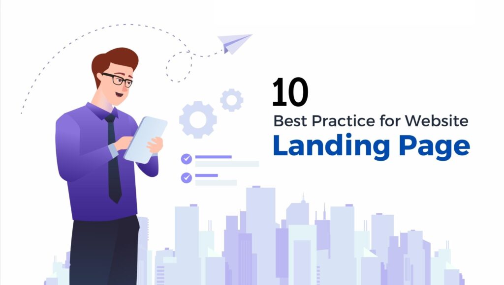
Best Practices for Website Landing Page
Let’s now cover the Landing Page best practices that will go a long way in boosting your conversions.
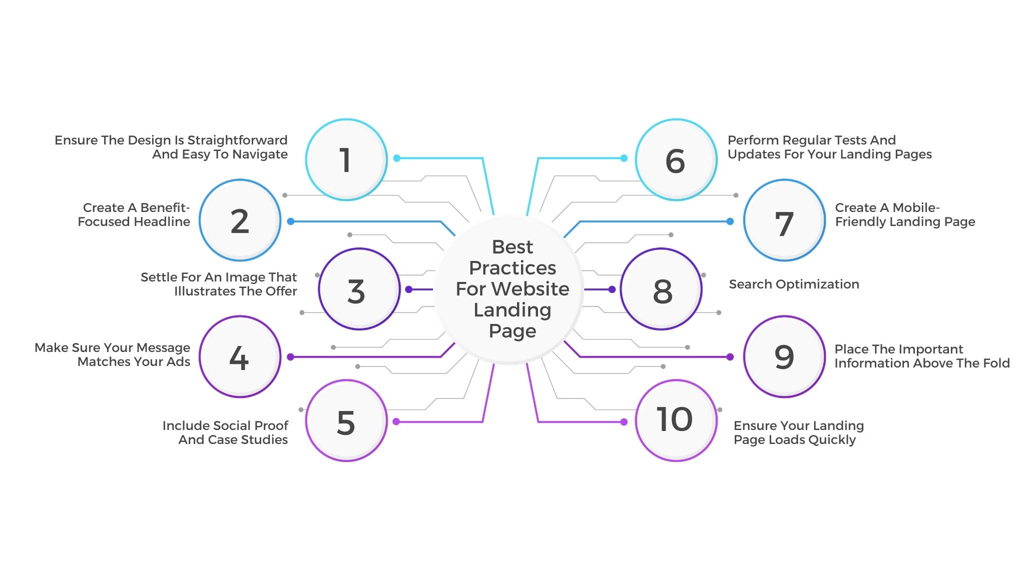
1. Ensure the design is straightforward and easy to navigate
I have no doubt you have ever landed on a page and just got confused or somewhat lost. Or sometimes, you are looking for a particular icon to help you execute a specific command, and you simply can’t find it. Probably because there are too many dropdowns, display ads, and distractions. You may actually be losing conversion because of this reason.
Your landing page design must reflect your brand colors. It should look like something you would want to include on your website. Besides this, you also want to make the page navigable.
2. Create a benefit-focused headline
More than two-thirds of the people who visit your landing page will bounce off the page. Keeping this number low is vital for the success of your business. So, how do you achieve this? Ensure that your visitors know and understand what is in it for them within seconds of arriving.
The first thing people will encounter when visiting your page is your headline. That being the case, your headline should clearly and concisely communicate the value of your landing page and offer.
3. Settle for an image that illustrates the offer
Visual representation is critical. An image representation should represent your target audience. The main aim of the image should be to convey a feeling; it should provide a clear illustration of how your visitor will feel once they receive your offer. Some images may work better than others. It will be best for you to always split-test your options.
4. Make sure your message matches your ads
One of the main reasons you should be using landing pages is to ensure that you send people to a page that matches their expectations. Matching your landing page copy and design to the ads you are running in search or social is essential in making sure that your visitors have made a “good click.”
It will also be ideal for you to consider creating variant pages or using dynamic text replacement to ensure message match if you are running many ads with different headlines.
5. Include social proof and case studies
Regardless of how good you are or how good your offering is, including the voices of satisfied customers and community members will add an air of authenticity to your claims that even the best copy will lack. Even more important is that you should humanize these testimonials by including personal details such as full names, place of residence, job title, biographical details, videos, date of purchase, or even portraits. Understand that most of your visitors are going to distrust the typical marketing spiel unless you are profoundly original.
If you are in a position to include the nice things your customers have said about you, do it. So what if you do not have a large cache of compliments? Simple- lean on logos instead as long as you obtain permission. A few different platforms will integrate with your landing pages to keep reviews fresh such as Trust Pilot and Yelp. It is even possible to use simple embedded codes.
However, try and keep these reviews at the bottom of the page. This ensures that your audience is not distracted from the action you want them to take.
6. Perform regular tests and updates for your landing pages
While best practices are essential, A/B testing your landing pages is one of the best ways to ensure that you are converting as much as possible. Do you maybe feel that your problem-focused headline is not working? Or do you probably want to ask questions in a different order on your form? Or maybe you have your boss insisting that your CTA button should be fluorescent pink? Well, the best thing to do is test it out before you commit and make decisions based on data rather than gut instinct.
The content on your landing pages should be up to date for obvious reasons, just like any blog post or site page. If you notice that your previously best-performing ad is falling off, the problem may be outdated landing pages. Sometimes even a simple refresh of the background colors, some fresh copy, and a new CTA will prevent fatigue. It will also serve as a signal to Google and any other ad platform that the content is fresh.
7. Create a mobile-friendly landing page
It is essential for any marketing to make your landing pages compatible with any device or viewable on any screen size. A significant number of people browse using their smartphones. This implies that their screens will be smaller, interactivity will be more limited, and load times will be longer.
Looking at all these qualities, none is good for your mobile conversion rates. That means you’ve got to ensure better performance by designing a mobile-responsive landing page that adapts to these devices. You can shift the layouts, make CTAs more visible and shrink images or remove them entirely.
8. Search optimization
Optimizing for search with target keywords is very critical. Much as you will be driving visitors to your landing page through email blasts, social posts, and other marketing strategies, your page needs to be optimized for your paid campaigns and organic search Which means that when someone searches for your key phrase, they should find your landing page.
9. Place the important information above the fold
Like an email, you want to ensure that all the critical stuff is visible first when someone is clicking through your landing pages. Initially, the term ‘above the fold” refers to the upper half of the front page of a newspaper. Nowadays, this term more often describes what is visible on a screen before scrolling down. If you want to enhance visibility, keep your headline, call to action, and your unique sales proposition above the fold. Be careful not to cram more than you need to onto the screen, as it can make it difficult to see your CTA. Still, ensure that everything a visitor needs can be seen from the get-go.
There are things like testimonials, client logos, and case studies that you can comfortably place below the fold. Even suggested content can be placed below the fold.
10. Ensure your landing page loads quickly
Higher chances are that you already have landing pages if you are a marketer. A high bounce rate on a certain page could be a result of the long load time. While it can be pretty easy to cut corners with one-off landing pages, make sure that there is nothing too heavy or big on the page. When your landing page takes a long to load, it may damage any SEO you have done for the page.
How Do You Design a Landing Page?
It is not enough to only know the best practices regarding your landing pages. Ultimately, you will need to come up with one. When this time comes, you need to know how you can design one. When you think about design, what comes to your mind are creativity, colors, and pretty pictures.
But for a landing page, we look further into the meaning of design to mean functional, effective, and direction-oriented. To develop a well-designed landing page, you will have to tap into both your right and left brain. This article looks at how you can incorporate both concepts to get yourself a landing page that will convert your visitors.
-
Structure of the Landing Page
The good thing about landing pages is that you do not need to get too creative. Many landing pages are characteristically structured in this manner because it has been proven to work. While it is still okay to infuse your creativity through branded elements and images, you must stick to a landing page format that people are used to seeing. Here, we look at the five elements of a good landing page:
Headline: commands the visitors’ attention
1. Lead form: sits above the fold to capture visitors’ information
2. CTA: action-oriented and compelling
3. Relevant image
4. Copy and description: informs and entices your visitor to complete your form.
This doesn’t mean that your landing page is only limited to the components mentioned above. You are at liberty to include more than this. Ensure you know your audience, where they are from, and where they are in their buyer’s journey to know how much you need to include.
-
The layout of the Landing Page
Most people do not read every word of your well-crafted copy. Often, people will skim through and pull out the most important bits of information. You need to ensure that these bits stand out so that your visitors do not meet anything important. This brings us to a few critical things:
- Ensure that you place the most important information above the fold so that your visitor can see it without needing to scroll down.
- Do a blink test on your page. This means that a visitor should be able to gather the main message in less than five seconds.
- Make use of negative space to prevent your visitor from feeling overwhelmed. Negative space will enhance comprehension, engagement, and focus.
- Use bullets and short paragraphs to convey your message. This makes your copy easy to digest.
- Try working out the important copy into an F-pattern. This is the direction that most people scan a page online. Ensure that you work with the flow of visual patterns to drive people to the key points. These key points will get them to convert.
-
Page Colors for Landing Page
It is only expected that the design of your landing page, which includes the colors you use, should bear a reflection of your website. You realize that you are aiming for a long-term relationship with the people who visit your landing page. The implication here is that people visiting your site need to familiarize themselves with your branding colors and unique style. Ideally, the more people recognize your brand, the more trust they develop in you. And the more people trust you, the easier it is to get them to do what you want them to do.
Consider using alternate colors on the elements of your page that require to stand out. One of these areas is your CTA button. What you’ve got to embrace here is the art of contrasting colors; you will want to go for colors that can easily draw your audience’s attention. Go ahead and research the colors that perform well-the colors that convert best- and use them on your landing page.
-
Images on your Landing Page
One of the first things that people will see on your landing page is the image there. People naturally process visuals quicker than they do text. Consequently, the images on your landing page set the tone of their entire experience. The question, however, is- how do you choose between the millions of stock photos taking up space in your computer? Let’s look at a few things that will guide your selection, shall we?
1. Your target audience: The knowledge of your target audience will come in handy when selecting the images for your landing page. Ask yourself questions like: “what is your persona?”, “How does your persona look like?”, “What is their dressing code?” “what are their interests?”. Such questions and their answers will guide you in determining the images to be placed front and center on your landing page. If you are looking to appeal to your audience, then your images must represent them in some way.
2. The point of focus on your landing page: The concept of knowing where you want your audience to look on your landing page is based on the idea that people follow directional clues. It is like where someone is pointing. What I’m trying to say is that if you want people to do a particular thing, consider an image that drives their attention toward that very action.
3. The message: Ultimately, the images on your landing page should act as a reinforcement to your message. Keep in mind that every element on your landing page has a specific purpose. Because your image is the first thing that people will see, it is important that it helps clarify what the visitor can expect from your page. The whole point is that you need to make sure that your image adds value.
Most of the tips covered apply to all landing pages. Still, lead gen landing pages require a little bit of something else to work optimally. This list goes over some of the few extra pointers that will make a difference, especially for your nurture-based campaigns:
-
- Reduce friction with multi-step forms
- Include a privacy policy
- Avoid manual entry
- Say “thank you.”

Whether your business has gotten this far without a website or you are simply a business owner on the fence Read more
Familiarizing yourself with the various kinds of web pages is very crucial. It does not matter whether you are a Read more

One of the most significant and most popular ways of building an online presence is by creating a website. In Read more

Website design practices have gone through an evolution process over the years. Every year brings forth advancement or improvement in Read more