Mobile SEO is the process of optimizing a website for people who use smartphones and tablets. It helps improve the mobile user experience and makes website content easier for search engines to access and understand.
Google primarily uses the mobile version of a website for indexing and ranking. This approach is known as Mobile-First Indexing. Therefore, businesses need to ensure that their mobile websites offer useful content, load quickly, and work well on different screen sizes.
Moreover, a mobile-friendly website helps visitors find information with less effort. As a result, users can browse pages more easily and interact with your business.
In this guide, you will learn what mobile-first indexing means, why it matters, and how to apply seven mobile SEO best practices to improve your website’s performance.
What Is Mobile-First Indexing?
Mobile-first indexing means Google mainly uses the mobile version of a website’s content for indexing. Google then uses this content to understand the page and determine its relevance to search queries.
For example, if your desktop website contains important information that is missing from the mobile version, Google may not have access to that information when indexing your page.
Therefore, your mobile website should include the same important content, headings, images, links, and structured data as your desktop version.
However, Mobile-First Indexing does not mean that Google only indexes mobile websites. It also does not guarantee higher rankings simply because a website works well on smartphones.
Instead, Google aims to understand and rank useful content while providing a good experience to users across devices. That is why mobile website optimization is an important part of an effective SEO strategy.
Why Is Mobile-First Indexing Important for Mobile SEO?
Mobile-first indexing makes the mobile version of your website especially important for search visibility. If your mobile pages are missing content or are difficult to use, your website may not perform as well as it could in search results.
Here are the main reasons why Mobile SEO matters.
- Better content access: Google can access the important content available on your mobile pages.
- Improved user experience: Visitors can read content, navigate pages, and find information more easily.
- Faster page loading: Optimized pages help reduce waiting time, especially on slower connections.
- Easier navigation: Clear menus and well-designed buttons help users move through your website.
- Stronger SEO foundation: A consistent mobile experience helps search engines understand your website.
In addition, mobile optimization supports users at different stages of their buying journey. For example, a potential customer may search for a service on a smartphone before contacting your business.
Therefore, making your website mobile-friendly can help you serve visitors more effectively and support your wider SEO goals.
How to Check If Your Website Is Optimized for Mobile-First Indexing
Before making changes, you should check how your website performs on mobile devices. This helps you identify problems that may affect usability, crawling, and indexing.
Follow these steps to review your mobile website.
1. Check Google Search Console.
First, open Google Search Console and inspect important website URLs using the URL Inspection tool. Review the indexing status, last crawl information, and any reported issues.
2. Test your website on different devices.
Next, open your website on a smartphone, tablet, and desktop computer. Check whether the text is readable and the layout adjusts to each screen size.
3. Review your page speed.
Use Google PageSpeed Insights to test your pages. The report highlights loading speed, responsiveness, and visual stability issues.
4. Compare mobile and desktop content.
Make sure both versions contain the same essential text, headings, internal links, images, and structured data. Also, check that important content is not hidden or removed from mobile pages.
5. Check navigation and buttons.
Finally, test menus, forms, calls to action, and other interactive elements. Make sure users can tap buttons easily and complete important actions without difficulty.
By checking these areas regularly, you can find mobile usability issues and address them before they affect your visitors.
7 Best Mobile SEO Practices for Mobile-First Indexing
Now that you understand mobile-first indexing, it is time to improve your website. The following mobile SEO best practices can help you create a better mobile experience and make your content easier for search engines to understand.
1. Use Responsive Web Design
Responsive web design allows your website to adjust automatically to different screen sizes. As a result, users can access your content on smartphones, tablets, and desktop computers without needing a separate layout for every device.

A responsive website also makes maintenance easier because you can manage content and design from a single website structure.
To improve your mobile design:
- Use a responsive website theme or layout.
- Set the viewport correctly so pages fit the device screen.
- Make text readable without zooming.
- Ensure images and videos fit within the screen.
- Avoid horizontal scrolling.
- Keep menus and buttons easy to use.
For example, a three-column desktop layout can change to a single-column layout on a smartphone. This makes the content easier to read and navigate.
Therefore, responsive design is a strong starting point for Mobile SEO. It helps deliver a consistent experience while making your website easier to manage.
2. Improve Mobile Page Speed
Page speed is an important part of the mobile user experience. When a page takes too long to load, visitors may leave before they find the information they need.
Moreover, slow pages can make forms, menus, and other interactive features frustrating to use. Therefore, improving page speed should be a key part of your mobile optimization strategy.
Here are some practical ways to improve mobile loading speed:
- Compress large images without reducing their quality too much.
- Use modern image formats, such as WebP or AVIF, where appropriate.
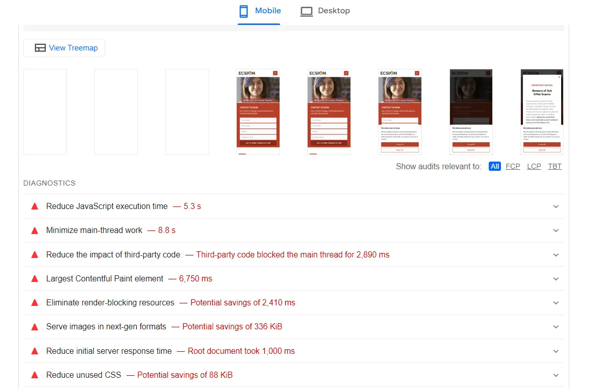
- Reduce unnecessary JavaScript and CSS.
- Remove unused plugins and scripts.
- Enable browser caching where suitable.
- Reduce server response time.
- Load below-the-fold images when needed rather than loading everything immediately.
You can use Google PageSpeed Insights to identify performance problems and get suggestions for improvement.
For additional guidance, review these resources:
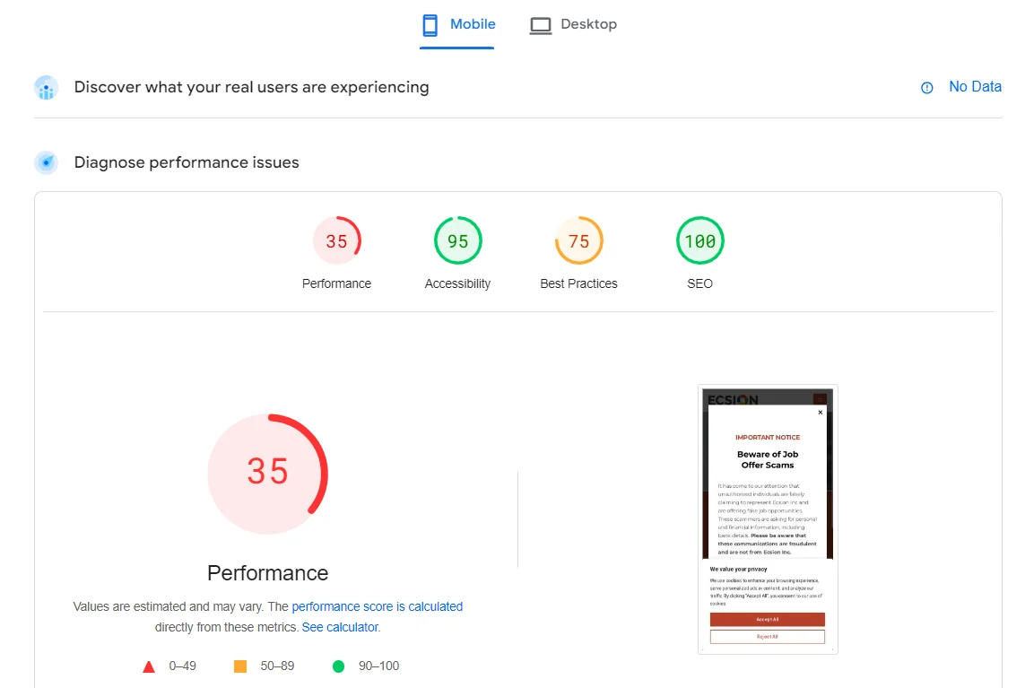
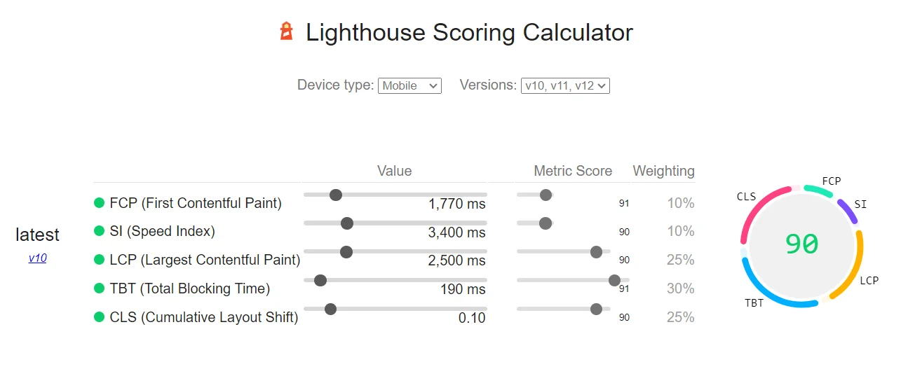
In addition, pay attention to Google’s Core Web Vitals. These metrics measure loading performance, responsiveness, and visual stability. Improving them can help create a smoother experience for your visitors.
3. Create Mobile-Friendly Content
Good content should be easy to read on every device. However, long paragraphs and crowded layouts can make mobile pages difficult to follow.
For this reason, structure your content so readers can quickly find the information they need.
Follow these content optimization tips:
- Use short paragraphs with two to four sentences where practical.
- Add clear H2 and H3 subheadings.
- Use bullet points to explain key details.
- Write simple sentences and avoid unnecessary jargon.
- Place important information near the beginning of the page.
- Use descriptive links that explain where they lead.
- Avoid intrusive pop-ups that block the main content.
For example, instead of writing one long paragraph about several SEO techniques, create separate sections for page speed, responsive design, and image optimization.
This approach improves readability and helps users scan the page more easily.
Additionally, ensure that important content remains available on mobile devices. If you use expandable sections, such as tabs or accordions, make sure users can access the content easily.
Ultimately, mobile-friendly content helps visitors understand your message while supporting Google’s ability to access the information on your pages.
4. Optimize Your Content for Conversational and Voice Searches
People often use natural language when searching on mobile devices. For example, they may type “best digital marketing agency near me” or ask a voice assistant, “How can I improve my website’s mobile speed?”
Therefore, writing clear answers to common questions can help your content meet different search needs.
To make your content more useful:
- Research questions your target audience commonly asks.
- Use natural language and clear wording.
- Add relevant question-based subheadings.
- Answer each question directly before providing more detail.
- Include local information when it is relevant to your business.
- Use descriptive page titles and headings.

For example, a section titled “How Can I Improve Mobile Page Speed?” clearly tells readers what the section covers. Begin with a direct answer, then explain the steps they can follow.
However, voice search does not require a separate SEO strategy. Focus on useful content, clear answers, and sound technical SEO practices.
As a result, your content can better serve users who search through typed queries, conversational queries, or voice assistants.
5. Use Structured Data Correctly
Structured data is code that helps search engines understand the information on a webpage. Depending on the content and the type of markup, it may also make a page eligible for enhanced search result features.
For example, a business website may use LocalBusiness schema, while an online store may use Product schema. An article may use Article or BlogPosting schema.
To optimize structured data for Mobile SEO:
- Add relevant schema types to the appropriate pages.
- Ensure the markup accurately reflects visible page content.
- Keep important structured data consistent between mobile and desktop versions.
- Use valid properties and required fields.
- Test the markup with Google’s Rich Results Test.
- Monitor indexing and enhancement reports in Google Search Console when available.
Importantly, structured data does not automatically improve rankings or guarantee rich results. Google decides whether an eligible page displays an enhanced result.
Nevertheless, accurate structured data can help search engines interpret your content and may improve how eligible pages appear in search results.
6. Optimize Images and Videos for Mobile Devices
Images and videos make your content more engaging. However, large media files can slow down your website and make pages harder to use on mobile devices.

Therefore, optimize your visual content before publishing it.
For images:
- Compress images to reduce file size.
- Use suitable formats, such as WebP or AVIF.
- Provide descriptive alt text for meaningful images.
- Use responsive images to serve suitable sizes for different screens.
- Specify image dimensions to reduce unexpected layout shifts.
- Avoid lazy-loading the main image when doing so would delay its display.
For videos:
- Use efficient video formats and appropriate compression.
- Avoid autoplay with sound.
- Provide captions when speech is present.
- Make playback controls easy to use on touchscreens.
- Use a responsive video layout.
- Consider lazy-loading embedded videos that appear lower on the page.
For example, a large image that is much wider than a mobile screen may use unnecessary data. Serving a properly sized image can reduce loading time without noticeably affecting visual quality.
In addition, descriptive alt text helps explain meaningful images to users who cannot see them and supports accessibility.
7. Monitor Mobile SEO Performance Regularly
Mobile SEO is not a one-time task. Website updates, new plugins, design changes, and larger media files can introduce problems over time.
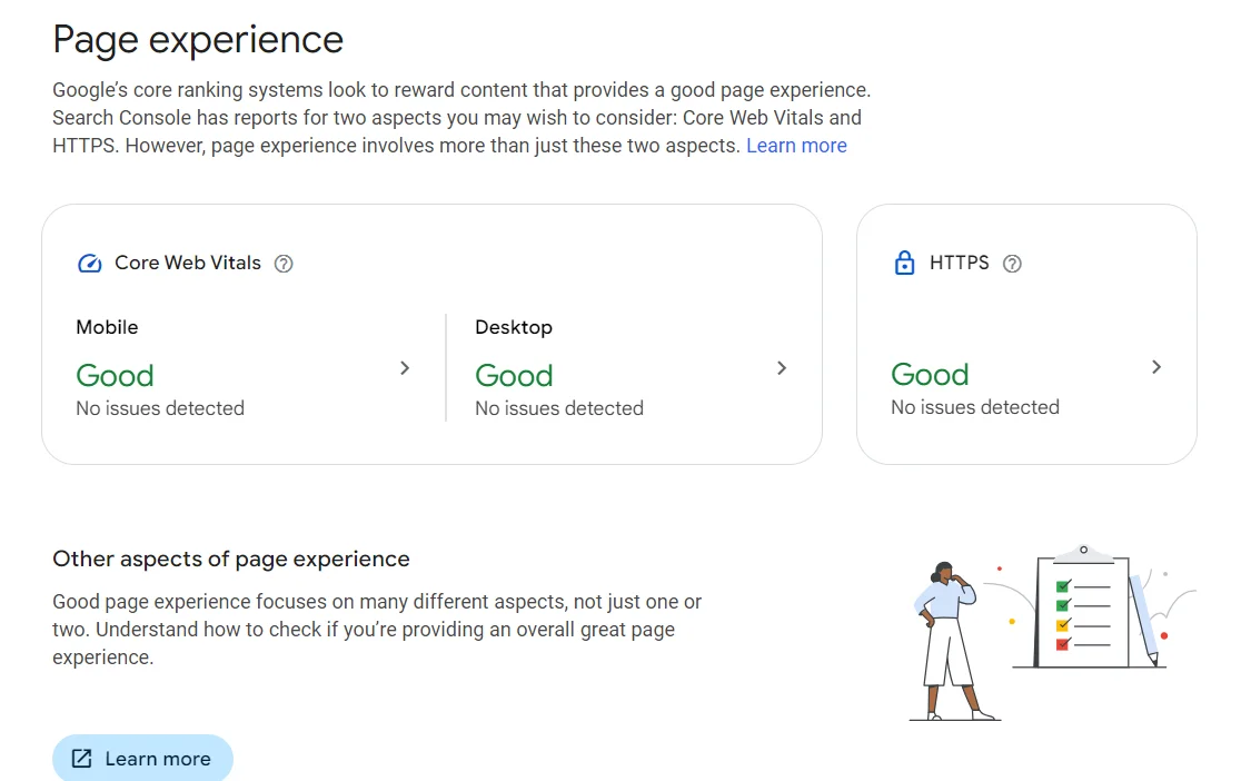


Therefore, regularly monitor your website to identify issues and maintain a good mobile experience.
Use these tools to review different aspects of your website:
Google Search Console: Check indexing status, inspect URLs, and review search performance and any available page experience or enhancement reports.
Google PageSpeed Insights: Measure page performance and identify opportunities to improve loading speed, responsiveness, and visual stability.
Google Analytics 4: Review mobile traffic, engagement, conversions, and other relevant user behavior metrics.
Browser developer tools: Test responsive layouts, screen sizes, and interactive elements.
During each review, check whether important pages load correctly, content remains accessible, and forms and navigation work as expected.
You should also compare mobile performance over time. For example, if mobile engagement or conversions decline after a website redesign, investigate whether the changes introduced usability or performance issues.
Regular testing helps you find problems early. As a result, you can improve the mobile experience and support your wider SEO goals.
Mobile SEO Checklist
Before publishing or updating a webpage, use this checklist to review the main Mobile SEO requirements.
The website uses a responsive layout.
Important content is available on mobile and desktop.
The page loads quickly on mobile devices.
Text is readable without zooming.
Menus, buttons, and forms work correctly.
Images and videos are optimized.
Important content can be crawled and indexed.
Structured data is accurate and valid.
Intrusive pop-ups do not block the main content.
Mobile performance is monitored regularly.
By following this checklist, you can identify common problems and maintain a more consistent experience across devices.
Conclusion: Build a Better Mobile SEO Strategy
Mobile SEO is an essential part of maintaining a website that serves both users and search engines. Since Google primarily uses the mobile version of a website for indexing, businesses should ensure their important content remains accessible and consistent across devices.
Start by using responsive design and improving page speed. Next, create readable content, optimize images and videos, and implement structured data correctly. In addition, monitor your website regularly to find technical issues and opportunities for improvement.
Ultimately, successful Mobile SEO is about more than making a website fit a smaller screen. It means providing useful content, simple navigation, and a reliable experience for every visitor. By following these best practices, you can build a stronger technical SEO foundation and help your website serve mobile users more effectively.
FAQ (Frequently Asked Questions)
1. What is Mobile SEO?
Mobile SEO is the process of optimizing a website for mobile users and mobile search performance. It includes responsive design, fast loading speeds, readable content, easy navigation, and technical improvements that help search engines access website content.
2. What is Mobile-First Indexing in SEO?
Mobile-First Indexing is Google’s approach of primarily using the mobile version of a website’s content for indexing. Therefore, important content and structured data should be available on the mobile version of your pages.
3. Does Mobile-First Indexing mean Google only indexes mobile websites?
No. Google can index websites that are not optimized for mobile devices. However, it primarily uses the mobile version of a website’s content for indexing. A poor mobile experience can still create usability problems for visitors.
4. How can I improve my website’s Mobile SEO?
You can improve Mobile SEO by using responsive design, reducing page loading times, optimizing images, creating readable content, checking structured data, and testing your website on different devices. In addition, use Google Search Console and PageSpeed Insights to identify problems.
5. Which tools can I use to check Mobile SEO?
Google Search Console helps you review indexing and search performance. Google PageSpeed Insights measures page performance and provides optimization suggestions. Google Analytics 4 can also help you understand mobile traffic, engagement, and conversions.
6. Does mobile page speed affect SEO?
Page speed contributes to user experience and is considered in Google’s ranking systems. However, speed alone does not guarantee higher rankings. Content relevance, quality, and other ranking factors also matter.
7. Is responsive design important for Mobile-First Indexing?
Yes. Responsive design helps your website adapt to different screen sizes and provides a consistent experience across devices. It is a recommended approach for mobile optimization, although Google does not require every website to use responsive design.