
Common website problems that cost you sales include slow loading speeds, poor mobile design, unclear messaging, weak calls to action, confusing navigation, missing trust signals, and complicated forms or checkout processes. Businesses can fix these issues by improving website speed, simplifying page layouts, strengthening content, building trust, and making it easier for visitors to take action.
Your website may attract visitors but still struggle to generate leads or sales. The problem is not always a lack of traffic. Sometimes, small website issues stop potential customers from taking the next step.
For example, a visitor may leave because a page loads too slowly. Another may struggle to find your services or understand what makes your business different. As a result, you could lose a potential customer even after spending money on marketing.
The good news is that many website problems can be identified and fixed. You do not always need a complete redesign. Instead, focus on the issues that make it harder for visitors to understand your offer, trust your business, and complete an action.
In this guide, you will discover seven common website problems that reduce sales, how to fix each one, and how to measure whether your changes are working.
1. Slow Website Loading Speed
Website speed plays an important role in the user experience. When pages take too long to load, visitors may leave before they see your products, services, or offers.
Slow websites can also make forms, product pages, and checkout steps feel frustrating. Therefore, improving website performance should be one of your first priorities.
Why slow loading speed costs you sales
Imagine a customer clicks your service advertisement. The landing page takes several seconds to display the main content. The visitor gets impatient and returns to the search results.
Your business has paid for the click but has not gained an enquiry. When this happens repeatedly, your marketing budget may generate less value.
Common causes of slow website loading include:
- Large, uncompressed images.
- Too many scripts or unnecessary plugins.
- Slow server response times.
- Poor browser caching.
- Unoptimized fonts and other page resources.
- Slow third-party tools or tracking scripts.
How to fix a slow website
Start by testing your key pages with Google PageSpeed Insights. It provides performance information and suggestions for improvement.
Next, take these steps:
- Compress large images and use suitable modern image formats.
- Remove unnecessary plugins, scripts, and page elements.
- Enable appropriate caching.
- Reduce delays caused by third-party tools.
- Review hosting and server response times.
- Test the website on mobile devices as well as desktop computers.
Also, monitor Core Web Vitals. These metrics help you understand loading performance, interaction responsiveness, and visual stability. Example: A furniture store finds that its product pages contain oversized images. After compressing them and improving page loading, the store compares product enquiries and completed purchases before and after the changes.
The goal is not simply to achieve a perfect speed score. Instead, make the website fast enough for visitors to browse and buy without unnecessary delays.
2. Poor Mobile Website Design
Many customers browse websites on smartphones. However, some websites still display poorly on smaller screens. Tiny text, crowded layouts, hard-to-tap buttons, and forms that require excessive scrolling can make visitors leave.
A website that looks good on a desktop may not provide the same experience on a phone.
Why poor mobile design reduces conversions
Visitors should be able to understand your offer and take action without zooming in or struggling with the layout. When they cannot, even interested customers may abandon the process.
For example, a person looking for a local service may want to call the business immediately. If the phone number is difficult to find or the contact button is not easy to tap, the visitor may choose another provider.
How to improve mobile website design
Make your website responsive so its layout adapts to different screen sizes. Then review these elements:
- Use readable text and clear headings.
- Keep buttons large enough to tap comfortably.
- Make phone numbers and contact details easy to find.
- Avoid horizontal scrolling.
- Keep forms short and easy to complete.
- Make important information visible without excessive scrolling.
- Check that pop-ups do not cover the main content.
Furthermore, test your main customer journey on an actual smartphone. Visit a service page, open the contact form, enter details, and submit it. For an online store, test the full checkout process.
Example: A consulting firm notices that mobile visitors view its service pages but rarely submit enquiries. The team improves the mobile layout, moves the main contact button higher, and reduces unnecessary form fields. It then measures whether the enquiry completion rate improves.
3. Unclear Website Content and Weak Messaging
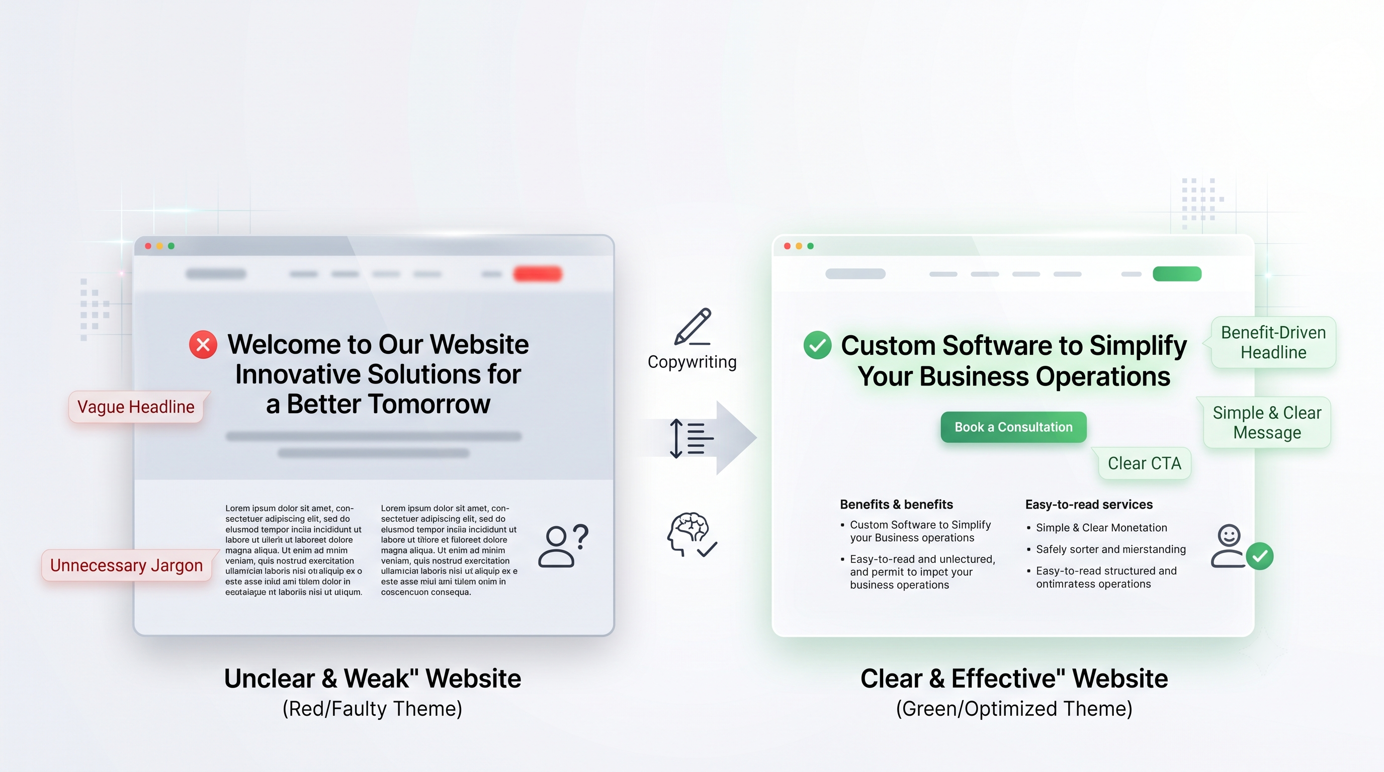
Visitors need to understand what your business offers, who it serves, and why they should choose you. If your website uses vague headlines or complicated language, potential customers may struggle to see its value.
A homepage that says only “Welcome to Our Website” does little to explain what the business can do for its audience.
Why unclear messaging loses customers
People often compare several businesses before making a decision. If your website does not explain your services clearly, visitors may not spend time searching for answers.
As a result, they may leave without contacting you, even when your business could meet their needs.
How to make your website content clearer
Write your main headline around the customer’s need and the value your business provides.
For example:
Weak headline: “Innovative Solutions for a Better Tomorrow”
Stronger headline: “Custom Software to Simplify Your Business Operations”
The second headline tells visitors what the business offers and the problem it helps solve.
Use these guidelines to improve website messaging:
- Explain your main offer near the top of the page.
- Use simple language instead of unnecessary jargon.
- Highlight benefits alongside product or service features.
- Answer common customer questions.
- Explain what makes your business different.
- Use clear headings to organize information.
- Include relevant examples, results, or proof where available.
In addition, make sure your landing page matches the advertisement, search result, or link that brought the visitor there. If an ad promises a particular service, the landing page should explain that service immediately.
This connection helps visitors move naturally from interest to action.
4. Weak Calls to Action That Do Not Encourage Action
A call to action (CTA) tells visitors what to do next. Examples include “Request a Quote,” “Book a Consultation,” “Shop Now,” and “Get Started.”
Without a clear CTA, visitors may read your content but remain unsure about the next step.
Why weak CTAs reduce website conversions
A button that says “Click Here” does not explain what happens next. Similarly, a page with several competing buttons can make it difficult for visitors to decide what to do.
A strong CTA makes the next step clear and relevant to the visitor’s needs.
How to improve your website CTAs
Choose an action that matches the purpose of each page.
| Page type | Example CTA |
| Service page | Request a Quote |
| Contact page | Talk to Our Team |
| Product page | Add to Cart |
| Consultation page | Book a Consultation |
| Lead generation landing page | Get Your Free Estimate |
| Software product page | Start Your Free Trial |
Place the main CTA where visitors can find it easily. Include supporting information that explains the value of taking action.
For example, a service business could replace a generic “Submit” button with “Request My Free Quote.” The new label makes the purpose of the form clearer.
However, do not assume that one CTA will work best for every audience. Test different wording, placement, and supporting messages. Then compare the results using conversion data.
5. Confusing Website Navigation
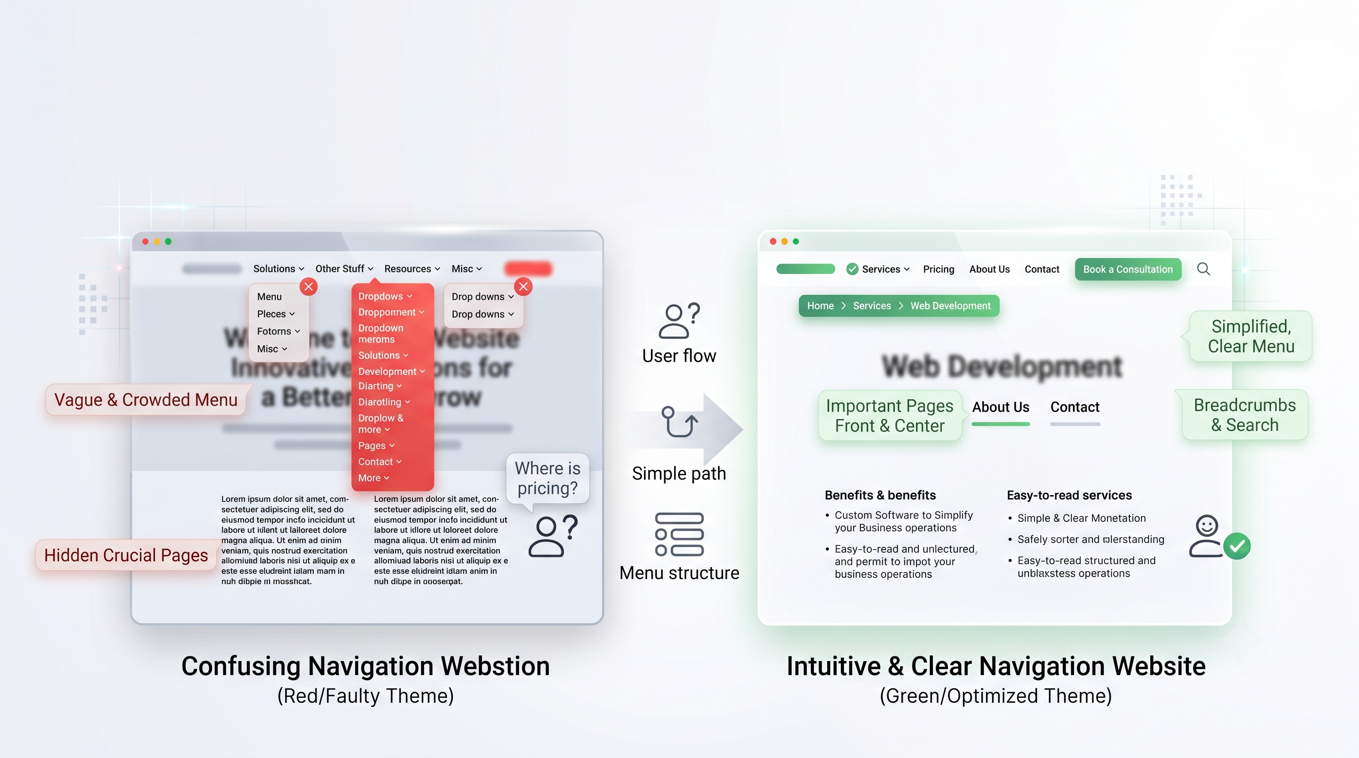
Website navigation helps visitors find the information they need. When menus are crowded, page labels are unclear, or important links are difficult to locate, visitors may struggle to explore your website.
This can be especially harmful when customers need to compare services, review pricing, or find contact details before making a purchase.
How confusing navigation affects sales
Imagine a potential customer visits a web development company’s website. The company offers custom websites, mobile applications, and software services. However, all its services are hidden under vague menu labels.
The visitor has to click several pages just to find the right service. Instead of continuing, the visitor may leave and choose a competitor with a clearer website.
How to improve website navigation
Organize your pages around what customers want to find. Keep your main menu focused on the most important sections.
Use these practices:
- Choose clear menu labels such as Services, Pricing, About Us, and Contact.
- Group related pages together.
- Keep the main navigation simple.
- Add relevant internal links within page content.
- Include a search feature when the website has many pages.
- Make important contact options easy to find.
- Use breadcrumbs when they help visitors understand where they are.
Also, check your navigation on mobile devices. A menu that works well on desktop may be harder to use on a small screen.
A clear structure helps visitors move from discovering your business to reviewing your offer and contacting you.
6. Missing Trust Signals and Weak Credibility
Visitors need a reason to trust your business before they share personal information or make a purchase. A website with little company information, unsupported claims, or no clear contact details may create doubt.
Trust matters even more when customers are considering an expensive service or an unfamiliar brand.
Why a lack of trust can cost sales
Potential customers often look for signs that a business is genuine and capable of delivering what it promises. Without these signals, they may hesitate to submit a form, book a service, or complete a purchase.
For example, a customer may compare two software companies. One explains its services clearly and provides genuine client testimonials, company details, and support information. The other makes broad claims but offers little evidence. The first company may appear more credible.
How to build trust on your website
Add relevant information that helps customers make an informed decision.
Consider including:
- Genuine customer testimonials and reviews.
- Relevant case studies or project examples.
- Clear contact information.
- An informative About Us page.
- Transparent pricing or a clear explanation of how quotes work.
- Refund, shipping, privacy, or service policies where applicable.
- Secure payment options for online stores.
- Accurate business details and realistic claims.
Furthermore, make sure every trust signal is genuine. Do not invent customer reviews, display unsupported awards, or promise results you cannot substantiate.
For websites that collect personal information, explain how that information is handled. A clear privacy policy and appropriate security measures can help visitors feel more confident.
Trust signals do not guarantee a sale. However, they can help answer concerns that might otherwise prevent a customer from taking action.
7. Complicated Contact Forms and Checkout Processes
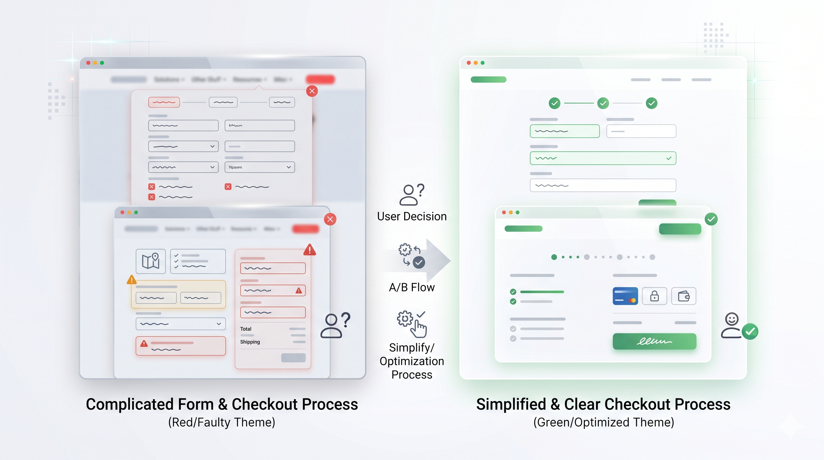
A visitor may be ready to contact your business or buy a product, but a difficult form can interrupt the process. Too many required fields, unclear error messages, and unnecessary steps can turn an interested visitor away.
For online stores, a complicated checkout can create a similar problem.
How complicated forms reduce sales
Suppose a customer wants a quote for a website project. The form asks for a name, email, phone number, company size, annual revenue, budget, full address, and several other details before allowing submission.
Some of this information may be useful later. However, asking for everything upfront can discourage people from completing the form.
How to simplify forms and checkout
Review each field and step. Keep only the information needed at that stage of the customer journey.
For contact forms:
- Ask for essential details first.
- Clearly mark required fields.
- Use helpful error messages.
- Make forms easy to complete on mobile.
- Explain what happens after submission.
- Confirm successful submissions with a clear message.
For online checkout:
- Show the total cost before the final step.
- Explain shipping fees and delivery times.
- Offer suitable payment options.
- Allow guest checkout where practical.
- Avoid asking for the same information more than once.
- Make payment errors easy to understand and correct.
Example: An online store discovers that customers often leave during checkout. The team reviews analytics and finds that shipping costs appear late in the process. By showing delivery costs earlier and simplifying checkout, the store can test whether more customers complete their purchases.
Measure completed forms, checkout completion, and abandonment rates to identify where visitors struggle.
How to Identify Which Website Problems Are Costing You Sales
Fixing every website issue at once can waste time and resources. Instead, use website analytics, performance tests, and customer feedback to find the biggest barriers first.
The following diagnostic framework connects common symptoms with possible causes and practical actions.
| Website symptom | Possible cause | What to do | What to measure |
| High traffic but few enquiries | Unclear messaging or weak CTA | Improve the offer, headline, and main CTA | Enquiry conversion rate |
| High mobile exit rate | Poor mobile layout or slow loading | Test mobile usability and page speed | Mobile conversion rate and engagement |
| Visitors leave before pages load | Slow server, large images, or heavy scripts | Improve loading performance | Core Web Vitals and loading time |
| Product views but few purchases | Unclear product details, pricing, or trust concerns | Improve product information and purchase guidance | Add-to-cart and purchase rates |
| Forms receive few submissions | Too many fields or confusing errors | Simplify forms and improve error messages | Form completion rate |
| Visitors struggle to find services | Confusing menus or weak internal links | Simplify navigation and page structure | Navigation paths and important-page visits |
| Checkout abandonment is high | Unexpected costs or too many steps | Show costs earlier and simplify checkout | Checkout completion rate |
A practical example: Diagnose before redesigning
Imagine a business receives 5,000 website visits in one month but only 25 enquiries.
Its enquiry conversion rate is:
[
\frac{25}{5{,}000}\times100 = 0.5%
]
The team should not immediately assume that the entire website needs to be replaced. Instead, it should review the traffic sources, landing pages, page speed, messaging, and enquiry form.
The investigation might show that most visitors arrive on a service page, but the contact button is difficult to find on mobile. The business could improve the mobile layout and simplify the enquiry form first.
Next, it should compare results over a suitable period while accounting for changes in traffic quality and marketing activity. If the conversion rate improves, the team has evidence that the changes helped.
The key is to diagnose the cause before choosing the solution.
How to Measure Whether Your Website Fixes Increase Sales
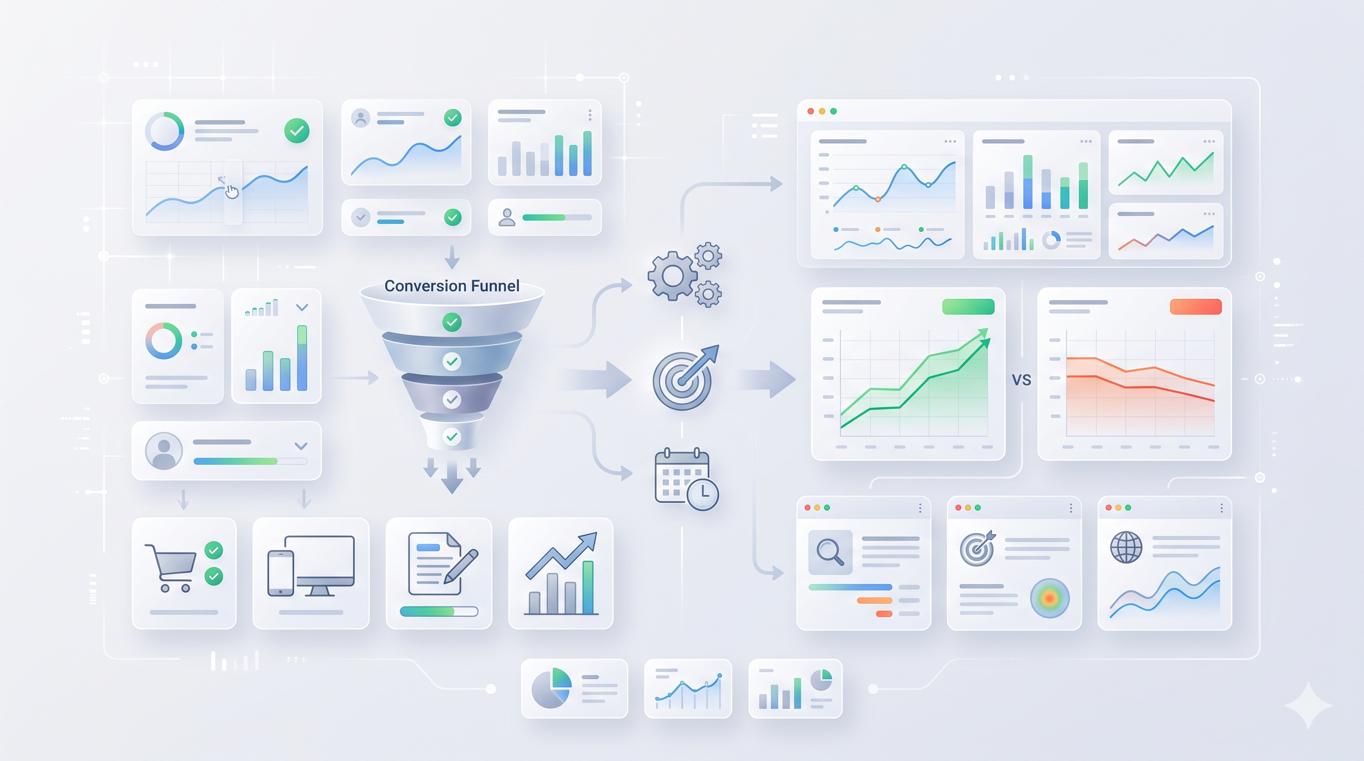
Website changes should be measured against business goals. A page that looks better is not necessarily a page that generates more revenue.
Track a small set of useful metrics before and after making changes.
Website conversion rate
Conversion rate measures the percentage of visitors who complete a desired action, such as submitting a form or purchasing a product.
For example, if 100 visitors complete a purchase out of 4,000 visitors, the conversion rate is 2.5%.
Lead and form completion rate
For lead generation websites, track how many visitors submit a form and how many people who start the form finish it. This helps identify problems with form length, usability, or errors.
Cart and checkout completion
Online stores should measure product views, add-to-cart actions, checkout starts, and completed purchases. These steps help reveal where shoppers abandon the buying process.
Mobile conversion rate
Compare mobile and desktop results. A large gap may indicate that mobile visitors face problems with speed, navigation, forms, or checkout.
Revenue and customer acquisition cost
Sales and revenue show the business impact of website improvements. Businesses running paid campaigns should also monitor the cost of acquiring a customer and the quality of leads generated.
Use tools such as Google Analytics and Google Search Console where appropriate. Analytics helps you understand user actions, while Search Console provides information about search visibility and technical search performance.
Remember that a change in conversion rate does not always prove that one website edit caused the result. Traffic sources, seasonality, pricing, and promotions can also affect performance. Where possible, use controlled tests and compare similar periods.
Frequently Asked Questions About Website Problems and Sales
1. What website problems cause the most lost sales?
Common problems include slow loading speed, poor mobile design, unclear messaging, weak calls to action, confusing navigation, missing trust signals, and complicated forms or checkout processes. The biggest issue varies by website, so use analytics and usability testing to identify where potential customers leave.
2. How can I improve my website conversion rate?
Start by making your offer clear, improving page speed, simplifying navigation, and using relevant calls to action. Next, reduce unnecessary form fields and add genuine trust signals. Track completed enquiries or purchases to determine which changes improve results.
3. Does website speed affect sales?
Slow loading can frustrate visitors and interrupt the path to a purchase or enquiry. Improving speed can create a better user experience, but the impact on sales depends on the audience, website, and other factors. Measure performance alongside conversions to understand the effect.
4. How can I make my website more mobile-friendly?
Use responsive design, readable text, easy-to-tap buttons, and simple navigation. Also, make forms and checkout steps easy to complete on a phone. Test key customer journeys on real mobile devices to find issues that automated tools may not reveal.
5. Why does my website get traffic but no sales?
Your website may attract visitors who are not ready to buy, or the page may fail to explain the offer clearly. Other causes include slow loading, weak CTAs, unexpected costs, or a difficult checkout. Review traffic sources, landing pages, and conversion data before making changes.
6. How often should I review my website performance?
Review key metrics regularly and after major website changes. Check important pages for speed, broken links, form errors, mobile usability, and conversion performance. The right schedule depends on how frequently your website changes and how much traffic it receives.
Turn Website Visitors Into Customers
A website should help visitors understand your offer, trust your business, and take the next step. Slow loading, poor mobile design, unclear messaging, weak CTAs, confusing navigation, missing trust signals, and complicated forms can all stand in the way.
However, you do not need to fix everything at once. Start with the pages that attract the most valuable traffic or show the clearest signs of lost conversions. Use analytics and performance tests to find the problem, make focused improvements, and measure the results.
By improving the user experience and removing barriers to action, you can give more visitors a clear path from discovering your business to becoming customers.